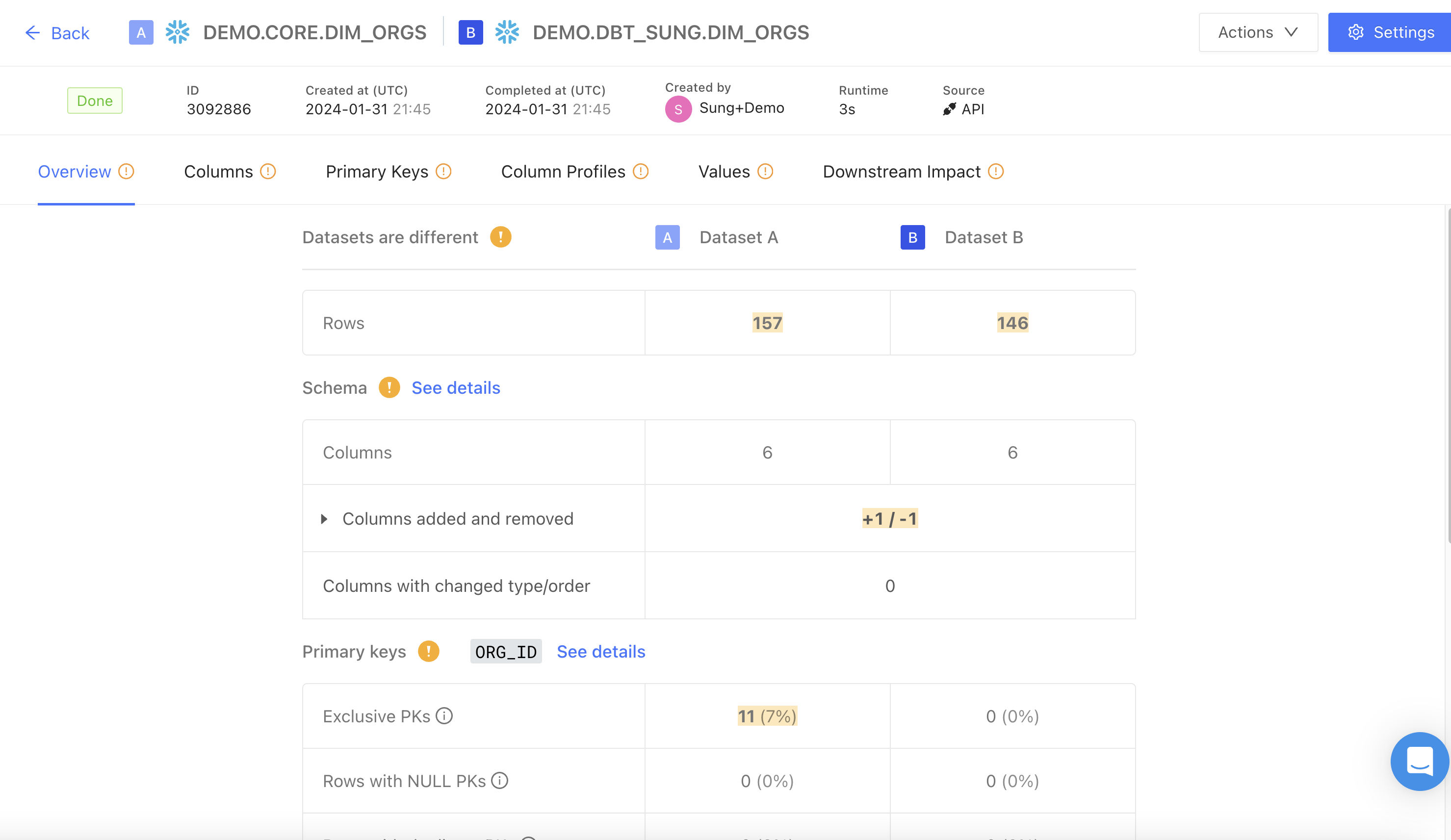
Overview
The top-level menu displays the diff status, job ID, creation and completed times, runtime, and data connection.
Match Score
The Match Score is the percentage shown in the Overview tab. It summarizes how similar the two datasets are across rows, columns, and values in a single number between 0% and 100%.
clamped to the range 0%–100%.
Total cells is the sum of cells in both tables:
Non-matching cells is the sum of three contributions:
Value differences are multiplied by 2 because each differing cell is counted once on Table A’s side of the denominator and once on Table B’s side. This keeps the score on a consistent scale regardless of whether a discrepancy comes from a value change, a missing row, or a missing column.
Example
Table A has 100 rows × 10 columns (1,000 cells). Table B is identical in shape and content except for 4 differing values.
- Total cells: 1,000 + 1,000 = 2,000
- Non-matching cells: 4 × 2 = 8
- Match Score: (2,000 − 8) / 2,000 = 99.6%
Why an extra column lowers the score
Every contribution penalizes the score — not just value differences. A table with identical values but one extra column will not score 100%, because that column’s cells exist on only one side.
For example, if Table A has the extra column (100 rows × 1 column = 100 cells), those 100 cells are added to the non-matching count, dropping the score to (2,000 − 100) / 2,000 = 95%.
Edge cases
- Empty tables: if neither table has any cells, the Match Score is 0%, not 100%. There is nothing to match.
- Sampling: when sampling is enabled, the Match Score is computed using the sampled row counts, not the full table sizes. The score reflects the sample.
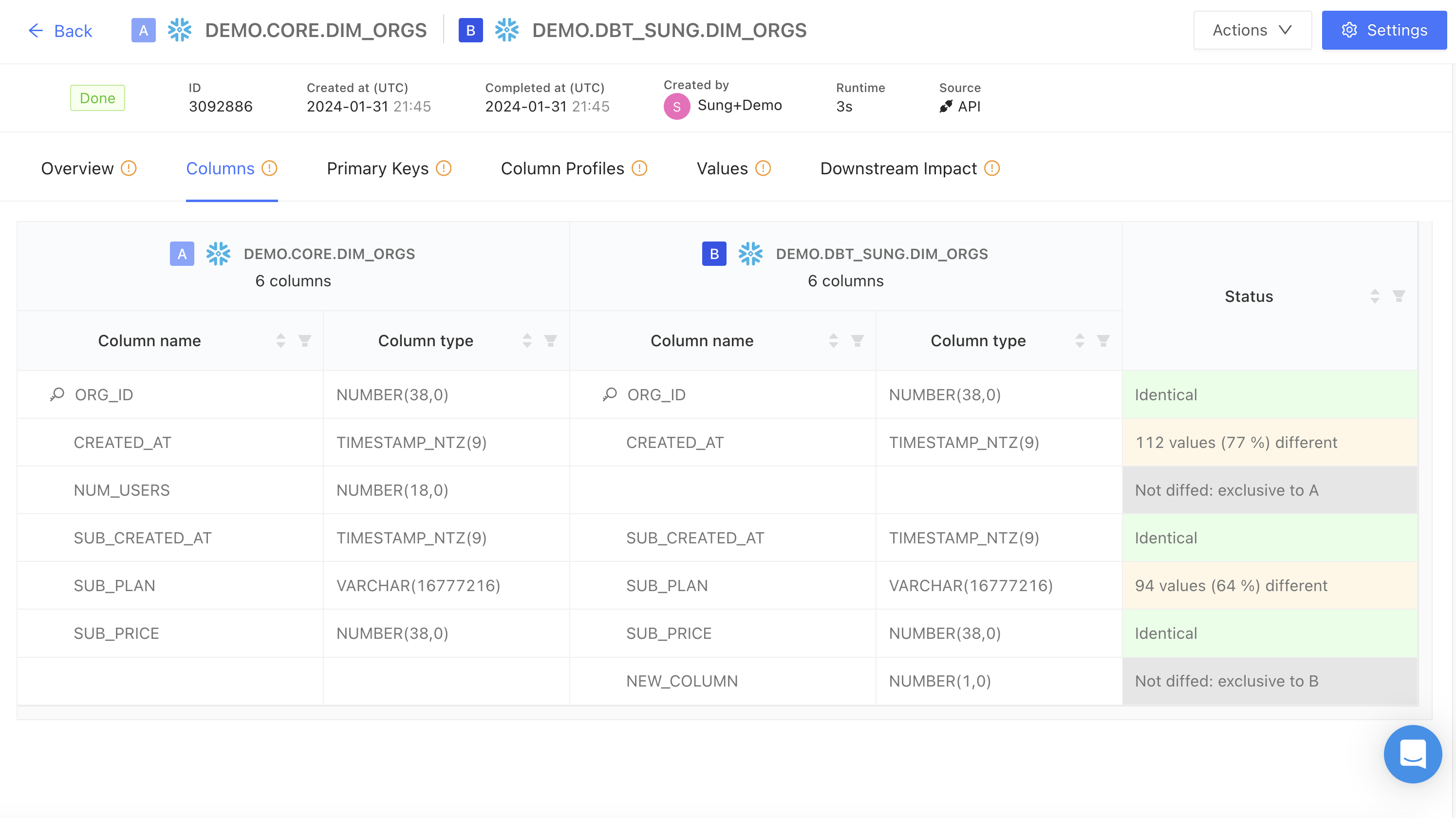
Columns
The Columns tab displays a table with detailed column and type mappings from the two datasets being diffed, with status indicators for each column comparison (e.g., identical, percentage of values different). This provides a quick way to identify data inconsistencies and prioritize updates.
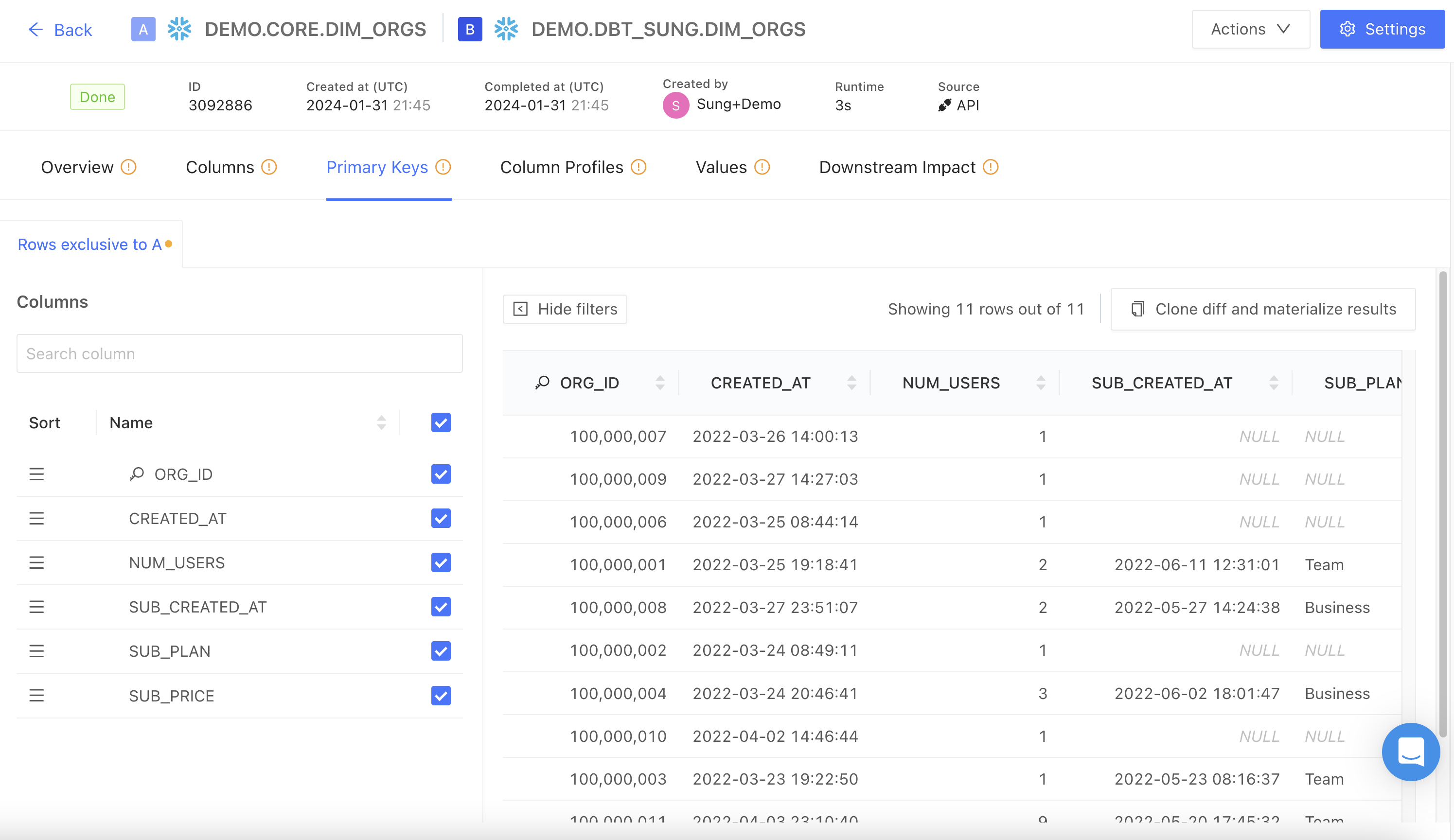
Primary keys
This tab highlights rows that are unique to the Test dataset in a data diff (“Rows exclusive to Test”). As this identifies rows that exist only in the Test dataset and not in the Main dataset based on the primary key, it flags potential data discrepancies.
The Show filters button allows you to filter these rows by selected column(s).
The Clone diffs and materialize results button allows you to rerun existing data diffs with results materialized in the warehouse, as well as any other desired modifications.
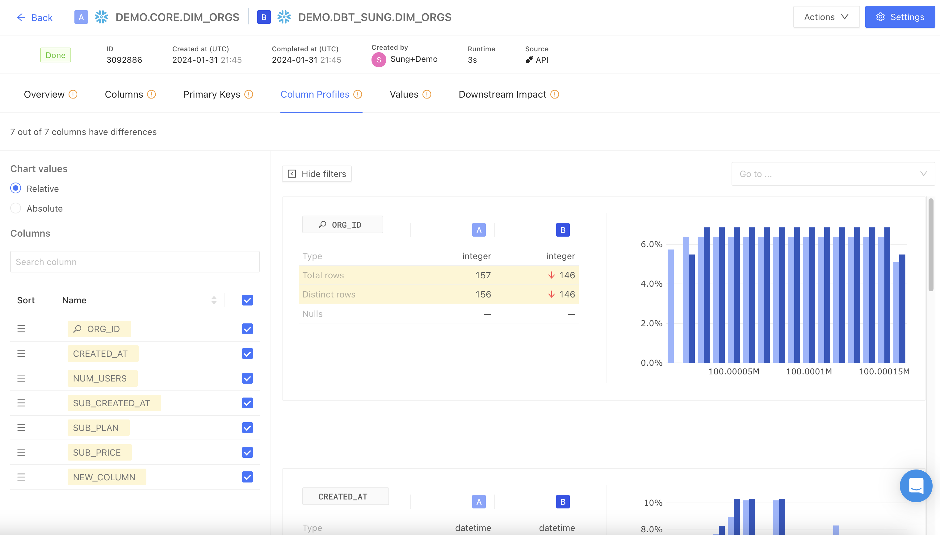
Column Profiles
Column Profiles displays aggregate statistics and distributions including averages, counts, ranges, and histogram charts representing column-level differences.
The Show filters button allows you to adjust chart values by relative (percentage) or absolute numbers.
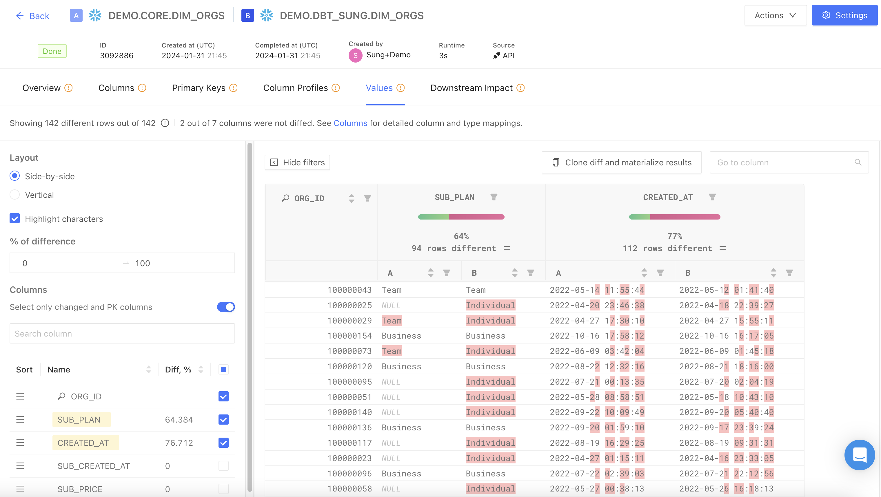
Values
This tab displays rows where at least one column value differs between the datasets being compared. It is useful for quickly assessing the extent of discrepancies between the two datasets.
The Show filters button enables the following features:
- Highlight characters: highlight value differences between tables
- % of difference: filters and displays columns based on the specified percentage range of value differences
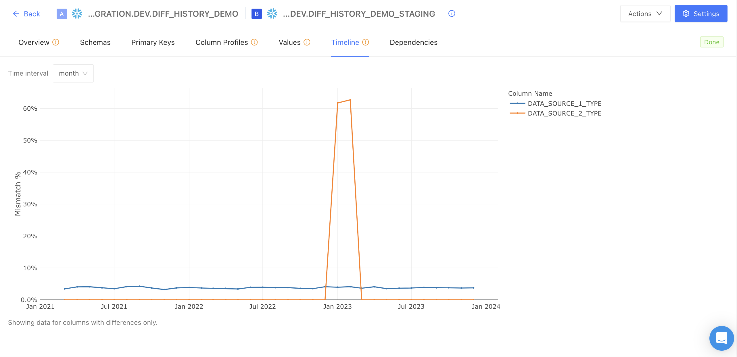
Timeline
The Timeline tab is a specialized feature that only appears if the time-series dimension column has been selected. It graphically represents data differences over time to highlight discrepancies. It only displays columns with data differences, and differences are presented as the share of mismatched data (percentage mismatched).
This feature offers enhanced clarity in pinpointing inconsistencies, supports informed decision-making through visual data representation, and increases efficiency in identifying and resolving data-related issues.
The Timeline feature is particularly useful in scenarios where an incremental model is mismanaged, leading to improper backfilling. It allows users to visually track the inconsistencies that arise over time due to the mismanagement. This graphical representation makes it easier to pinpoint the specific time frames where the errors occurred, facilitating a more targeted approach to rectify these issues.
It is also useful in correlating data differences with specific time intervals that coincide with changing data connections. When switching over or stitching together different data connections, there’s often a shift in how data behaves over time. The Timeline graph helps flag the potential impact of the source change on data consistency and integrity.
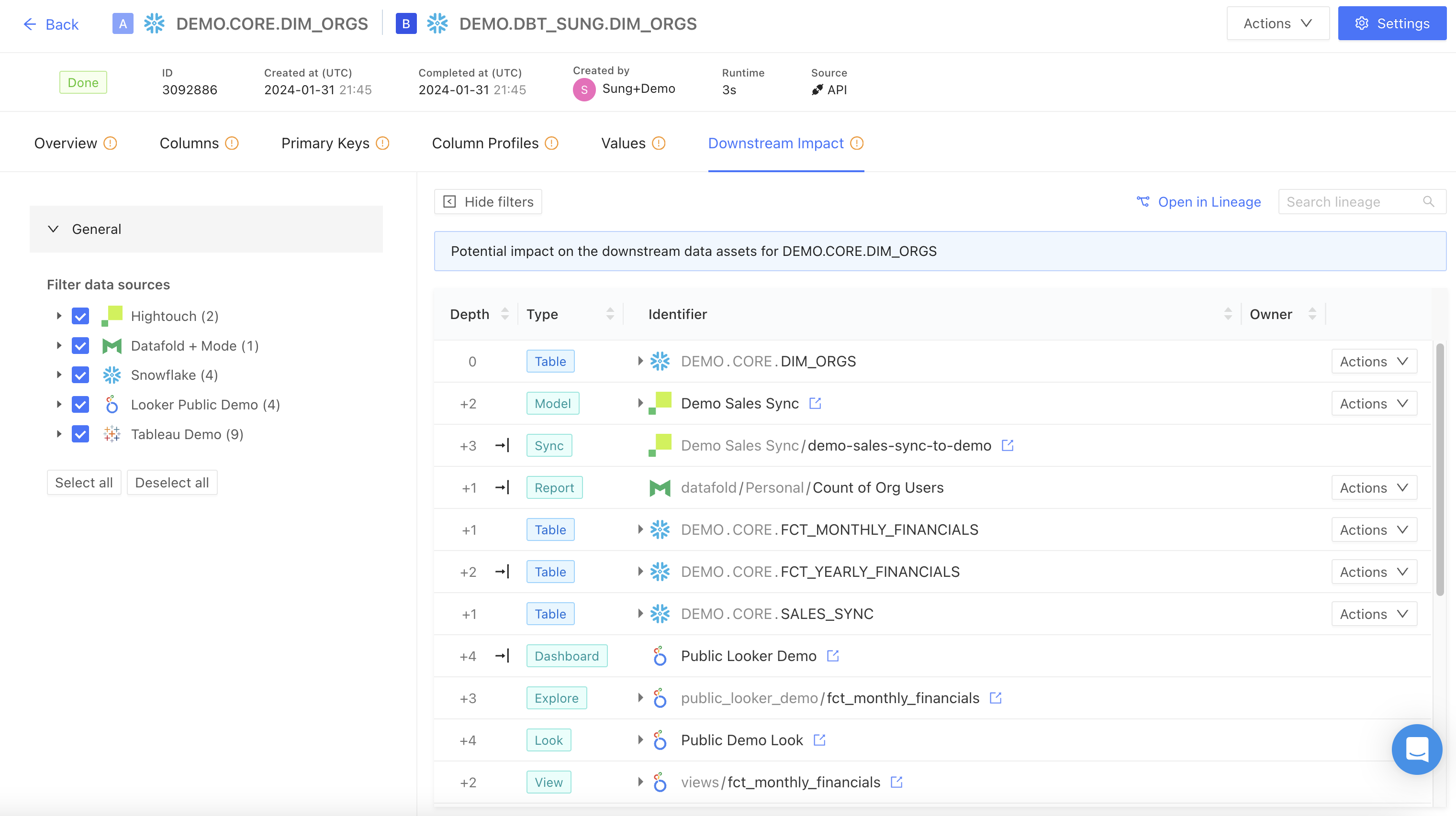
Downstream Impact
This tab displays all associated BI and data app dependencies, such as dashboards and views, linked to the compared datasets. This helps visually illustrate the impact of data changes on downstream data assets.
Each listed dependency is shown with a link to its lineage diagram within Datafold’s column-level lineage. You can you can filter by tables or columns within tables, or open this view in Data Explorer for further analysis.